Take a look at some of our Projects
All of our projects starts with a goal. Whether it’s building a new website, refreshing a brand or finding a better way to connect with customers, we focus on creating digital work that looks great, feels right and works hard for the people behind it.
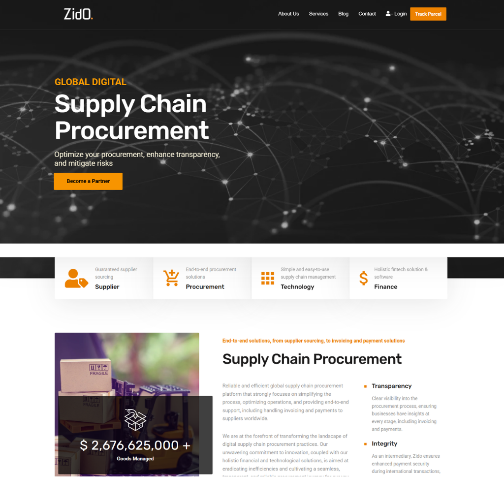
Web Re-design
Our approach was to rethink the existing website from the ground up, improving the structure, visual presentation and user journey.
The client needed a website that better reflected its business, communicated its services clearly and made it easier for potential customers to understand how it could support their logistics needs.
We reorganised the content to make key services easier to find, refined the messaging to communicate the company’s offering more clearly and introduced a cleaner, more modern design that strengthened the overall brand presence.
We also focused on creating a more intuitive experience across devices, with clear calls to action guiding visitors towards making an enquiry.
The result: a refreshed, professional website that gives Zido a stronger digital presence, communicates its services more effectively and provides a clearer path for potential customers to connect.
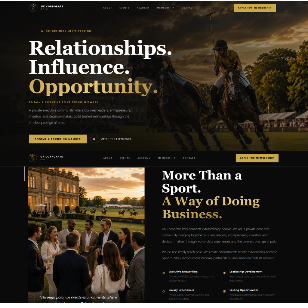
Web Design
Our approach was to turn the different elements of the corporate polo experience into a simple, easy-to-navigate website.
The client needed a website that could showcase its corporate polo offering while giving businesses a clear way to explore events, understand the experience and make an enquiry.
We organised the content around what potential clients need to know — from the polo experience itself and event information to corporate hospitality and opportunities to get involved.
Visually, we focused on using strong imagery and a refined layout to capture the atmosphere and exclusivity of polo, while keeping the user journey straightforward. Clear calls to action were incorporated throughout the site to encourage visitors to enquire and take the next step.
The result: a professional, engaging website that showcases UK Corporate Polo’s offering, communicates the experience clearly and provides a more effective way for businesses to discover and enquire about corporate polo opportunities.
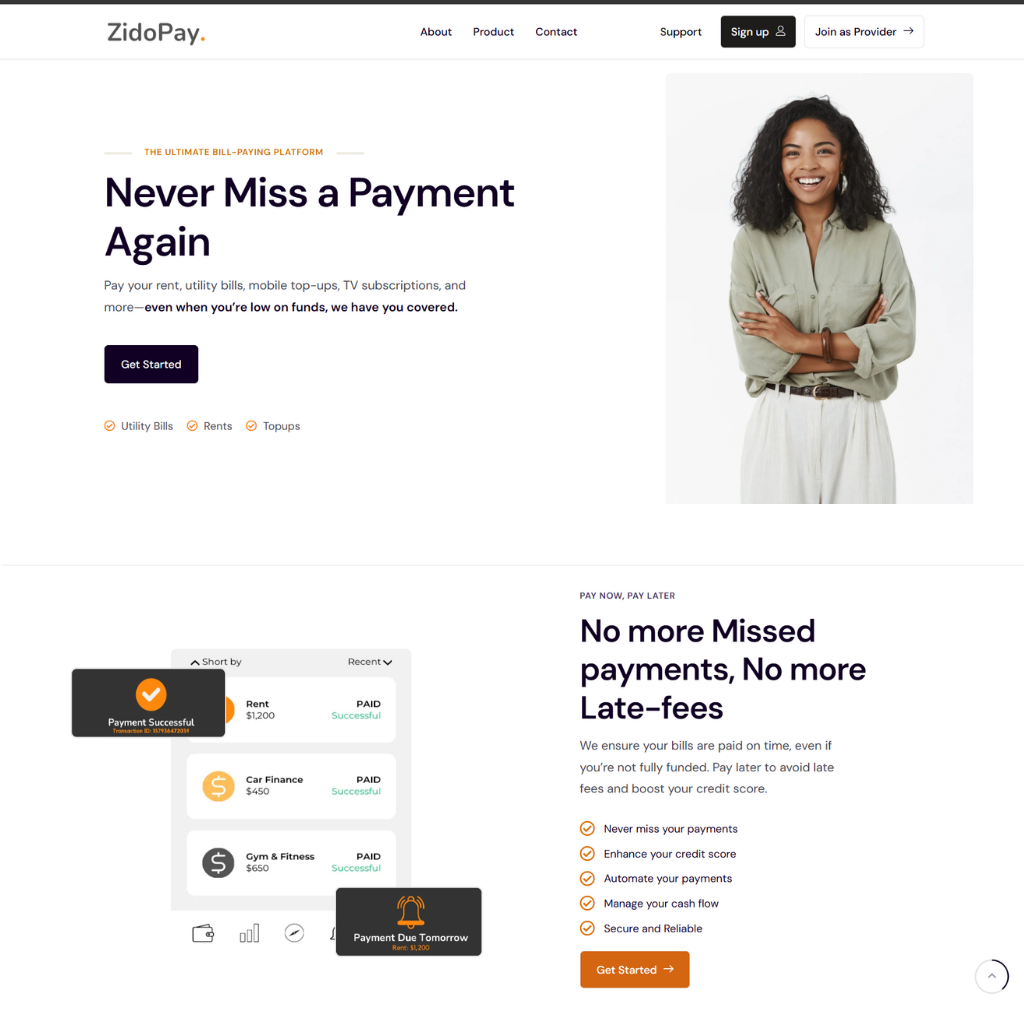
Web Design
Our Approach: we take something potentially complicated and make it clear, useful and easy to understand.
The client set out to make managing everyday bills easier by bringing multiple payments together in one simple platform. The challenge was to communicate this clearly while making the website feel approachable, trustworthy and effortless to use.
We designed a clean, intuitive website that guides visitors through what their offers, how the platform works and why it makes managing payments easier. Clear messaging, purposeful layouts and straightforward navigation help turn a potentially complicated financial service into an experience that feels simple and accessible.
The result: a modern digital presence that communicates their value clearly and gives users the confidence to take the next step.
Web Design
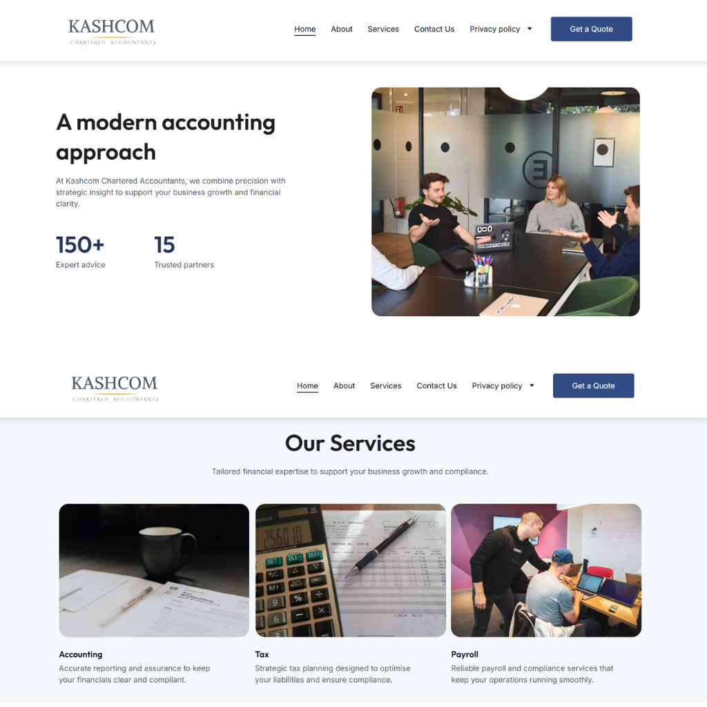
Our approach was to simplify the user journey and bring the brand, services and key information together in a clear and engaging digital experience.
The client needed a website that presented its services professionally, communicated its value clearly and gave visitors a straightforward way to understand what the business offers.
Our approach was to simplify the user journey and bring the brand, services and key information together in a clear and engaging digital experience. We focused on intuitive navigation, structured content and a clean visual design, making it easier for visitors to quickly understand them and find the information relevant to them.
We also designed the website with a strong focus on credibility and conversion, using clear calls to action and purposeful page layouts to guide visitors towards making an enquiry.
The result: a professional, user-friendly website that gives them a stronger online presence and makes it easier for potential clients to understand the business and take the next step.
Web Design
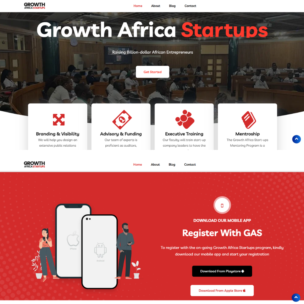
Our approach was to create a clear, structured and engaging digital experience that brings their different services together in one place.
With a wide range of programmes and services, they needed a website that could communicate their offering clearly and make it easy for entrepreneurs to find the support most relevant to them.
We focused on intuitive navigation, straightforward messaging and purposeful page layouts, making it easier for visitors to understand what Growth Africa Startups does, who they support and how they can get involved.
The website was designed to feel professional and credible while remaining approachable, reflecting Growth Africa Startups’ role in supporting ambitious entrepreneurs across Africa.
The result: a modern, purposeful website that strengthens their digital presence, communicates their value clearly and makes it easier for entrepreneurs to connect with the right opportunities and support.
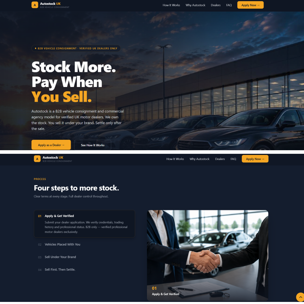
Web Design
A clear, straightforward website designed to make AutoStock's B2B offering easy to understand and navigate.
The client needed a website that could introduce a new business to the market while making its offering easy for dealers and partners to understand from the moment they arrived.
We designed a clear, straightforward website that guides visitors through what they do, how the process works and the value it provides. With simple messaging, intuitive navigation and a professional visual identity, the website was built to make complex B2B processes feel easy to understand and give potential partners the confidence to take the next step.
The result: a purposeful digital presence that communicates clearly, builds trust and makes it easy for the right people to understand how Autostock works.